Horizon Roasters
Project Overview:
Reflect the brand’s core values: quality, transparency, warmth, and a global outlook.
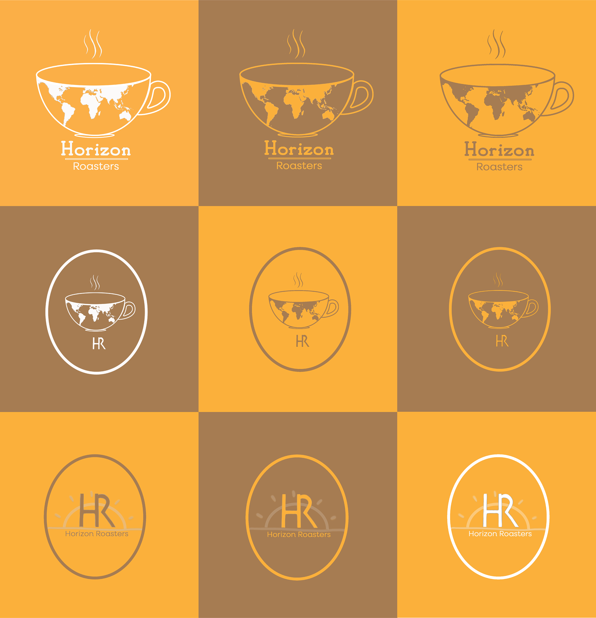
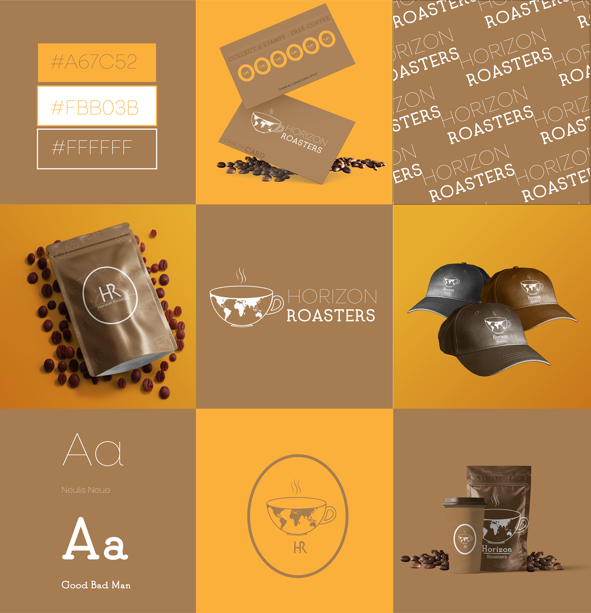
Create a versatile identity suitable for packaging, merchandise, and digital platforms. The primary logo integrates a coffee cup with a world map to subtly reference the global sourcing of beans. A clean, minimal style paired with a modern serif and sans-serif type combination was chosen to strike a balance between sophistication and approachability.
Deliverables Included:
• Primary logo design
• Secondary logo & submark
• Typography (Neulis Neue & Good Bad Man)
• Mockups for packaging, merchandise, and promotional material
• Brand colour palette (earthy tones: #A67C52, #FBB03B, #FFFFFF)