🌄 Tamborine Mountain
Project Overview:
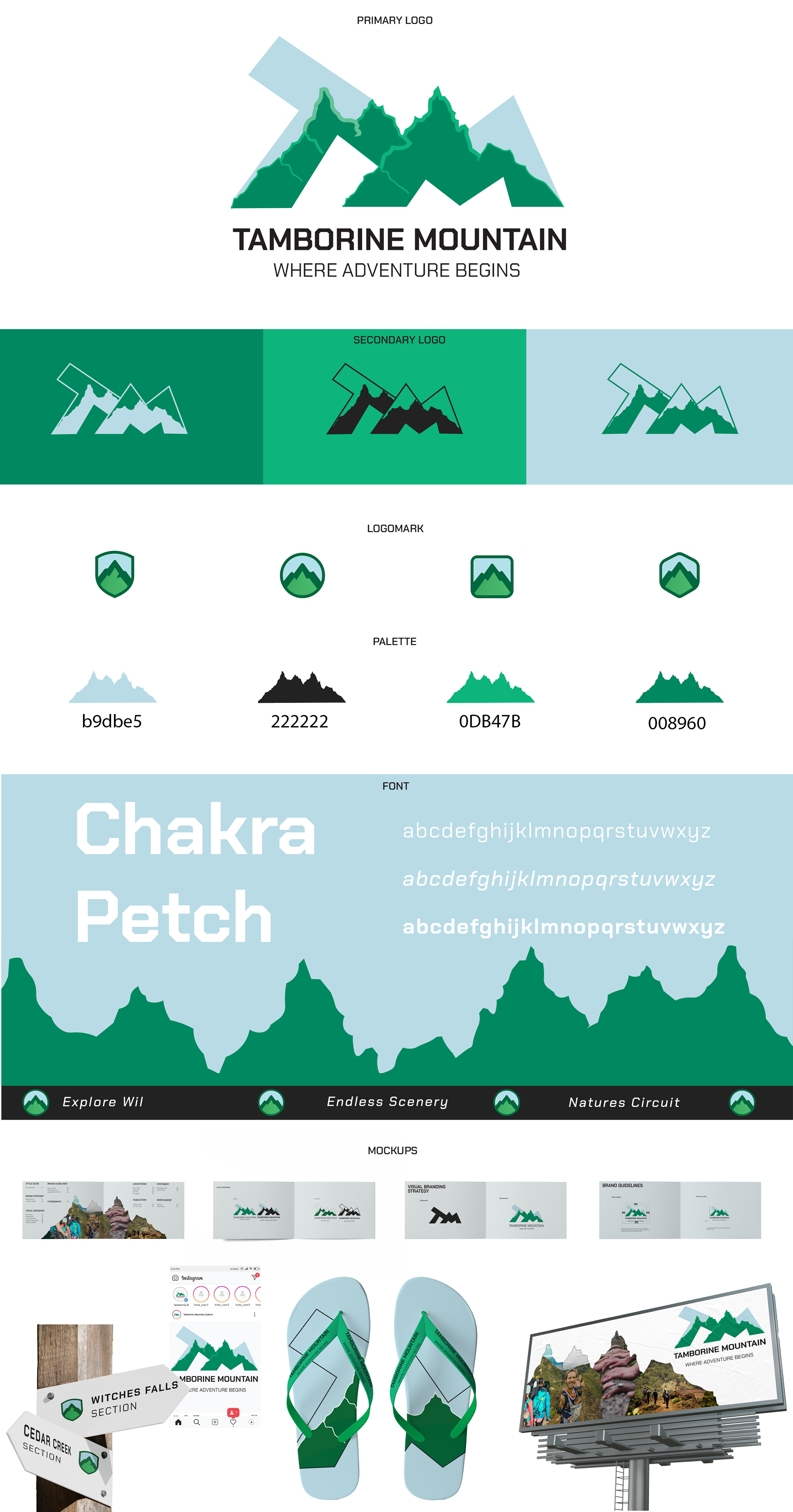
This brand identity project was created for Tamborine Mountain, a destination known for its rich natural beauty, hiking trails, and adventure experiences. The objective was to craft a bold, modern identity that communicates exploration, nature, and excitement.
This brand identity project was created for Tamborine Mountain, a destination known for its rich natural beauty, hiking trails, and adventure experiences. The objective was to craft a bold, modern identity that communicates exploration, nature, and excitement.
Design Approach:
The logo design cleverly integrates the letters “T” and “M” to represent Tamborine Mountain in a stylised, geometric mountain range. The bold peaks form a dynamic monogram that symbolises both the name and the landscape. The design balances sharp, adventurous angles with a clean, modern layout — evoking both exploration and stability. Supporting assets like secondary logos and logomarks were developed for adaptable use across signage, merchandise, and digital media.
The logo design cleverly integrates the letters “T” and “M” to represent Tamborine Mountain in a stylised, geometric mountain range. The bold peaks form a dynamic monogram that symbolises both the name and the landscape. The design balances sharp, adventurous angles with a clean, modern layout — evoking both exploration and stability. Supporting assets like secondary logos and logomarks were developed for adaptable use across signage, merchandise, and digital media.
Deliverables Included
• Primary Logo: Features geometric mountain peaks with sharp edges, layered to represent depth and discovery.
• Secondary Logos & Logomarks: Scaled down for versatile application across digital, print, and product mock-ups.
• Typography: Uses the rugged yet clean Chakra Petch font — perfect for blending structure and adventure.
• Colour Palette: A nature-inspired palette featuring deep forest greens and cool sky blues. Designed for both vibrancy and calm.
• Applications: Includes directional signage, flip-flops, social media previews, and billboards, all helping unify the brand across touchpoints.